Excel Worksheet Pareto Diagram Leave a comment
Analyzing Data for Effective Decision-Making
Introduction
In today’s data-driven world, businesses rely on accurate analysis to make informed decisions. Excel, a powerful spreadsheet software, provides numerous tools and features to assist in data analysis. One such tool is the Excel Worksheet Pareto Diagram, which helps identify and prioritize the most significant factors contributing to a problem or opportunity. In this article, we will delve into the concept of the Excel Worksheet Pareto Diagram, exploring its benefits, applications, and how to create one.
Excel Worksheet Pareto Diagram: Explained
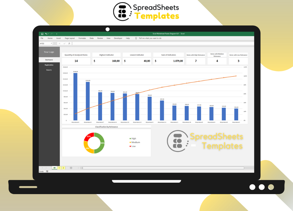
The Excel Worksheet Pareto Diagram, also known as the Pareto Chart, is a visual representation of data that helps identify the most critical factors affecting a process or outcome. It combines a column chart and a line graph to highlight the cumulative impact of different factors in descending order. This diagram provides a clear visualization of the “80/20 rule,” which states that approximately 80% of the effects come from 20% of the causes.
Understanding the 80/20 Rule
The 80/20 rule, also known as the Pareto Principle, asserts that a minority of causes typically lead to a majority of effects. This principle applies to various aspects of life, including business, economics, and quality management. When it comes to data analysis, the Pareto Diagram serves as a valuable tool to identify and prioritize the vital few factors that contribute the most significant impact.
Creating an Excel Worksheet Pareto Diagram
To create an Excel Worksheet Pareto Diagram, follow these simple steps:
- Step 1: Collect and Organize DataStart by collecting data related to the problem or opportunity you want to analyze. Ensure that the data is well-organized, with each factor represented in a separate column.
- Step 2: Calculate Cumulative PercentagesCalculate the cumulative percentages for each factor by dividing the cumulative sum of each factor’s value by the total sum of all factors. This step helps determine the cumulative impact of each factor.
- Step 3: Create a Column ChartSelect the data range and insert a column chart. Ensure that the factors are plotted on the horizontal axis and their corresponding values on the vertical axis.
- Step 4: Add a Line GraphAdd a line graph representing the cumulative percentages on the secondary vertical axis. This line graph will help visualize the cumulative impact of each factor.
- Step 5: Format the ChartFormat the chart by adding axis titles, data labels, and a chart title. Customize the appearance by selecting appropriate colors, fonts, and styles.
- Step 6: Analyze and Interpret the DiagramAnalyze the Pareto Diagram to identify the vital few factors that contribute the most significant impact. Focus on the factors that exhibit a steep decline in the line graph, indicating a rapid accumulation of cumulative impact.
Applications of Excel Worksheet Pareto Diagram
The Excel Worksheet Pareto Diagram finds applications in various fields and industries. Here are a few notable applications:
- Quality ManagementIn quality management, the Pareto Diagram helps identify the most common sources of defects or errors. By addressing these vital few factors, organizations can improve their overall product or service quality.
- Customer Satisfaction AnalysisAnalyzing customer satisfaction data using a Pareto Diagram enables businesses to identify the key factors influencing customer dissatisfaction. By prioritizing improvements in these areas, companies can enhance the overall customer experience.
- Inventory ManagementThe Pareto Diagram is valuable in inventory management to identify the most significant products or stock items that contribute to a majority of sales or consumption. By focusing on these items, businesses can optimize inventory levels and improve operational efficiency.
- Problem Solving and Decision-MakingWhen faced with a complex problem or decision, the Pareto Diagram helps break down the contributing factors and prioritize them based on their impact. This approach facilitates effective problem-solving and decision-making.
Frequently Asked Questions (FAQs)
- Q: What is the Excel Worksheet Pareto Diagram?A: The Excel Worksheet Pareto Diagram is a visual tool that helps analyze data to identify the most critical factors contributing to a problem or opportunity.
- Q: How does the Pareto Diagram relate to the 80/20 rule?A: The Pareto Diagram visually represents the 80/20 rule, demonstrating that approximately 80% of the effects come from 20% of the causes.
- Q: Can I create a Pareto Diagram in Excel?A: Yes, Excel provides the necessary features to create a Pareto Diagram easily. It offers a combination of column charts and line graphs to visualize data effectively.
- Q: What are the key applications of the Pareto Diagram?A: The Pareto Diagram finds applications in quality management, customer satisfaction analysis, inventory management, and problem-solving and decision-making.
- Q: How does the Pareto Diagram help in decision-making?A: By highlighting the vital few factors with the most significant impact, the Pareto Diagram helps prioritize actions and allocate resources effectively.
- Q: Can the Pareto Diagram be used in personal life?A: Absolutely! The Pareto Diagram’s principles can be applied to personal life situations, such as identifying the most critical factors contributing to stress or productivity.
Conclusion
The Excel Worksheet Pareto Diagram is a valuable tool for analyzing data and making informed decisions. By visually representing the most critical factors, it allows organizations to prioritize actions and allocate resources effectively. Whether in quality management, customer satisfaction analysis, or problem-solving, the Pareto Diagram provides valuable insights. So, next time you need to analyze data, consider leveraging the power of the Excel Worksheet Pareto Diagram to uncover the vital few factors that drive significant impact.


